There seems to be a lot of silver pundits calling for a major top in silver lately. There’s basically two main reasons why they are calling for a top: 1) silver is currently stretched above its long term moving averages and 2) silver looks spiky on a chart. Anybody that has followed markets for a while and looked at charts knows that when they see things like that they should grow cautious. This is because they have most likely experienced the other side of a spike at least once, where the market snaps back hard to the downside. They have also likely experienced that hard move down with an overly aggressive position due to being too bullish at the top, which caused even more painful losses.
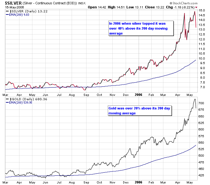
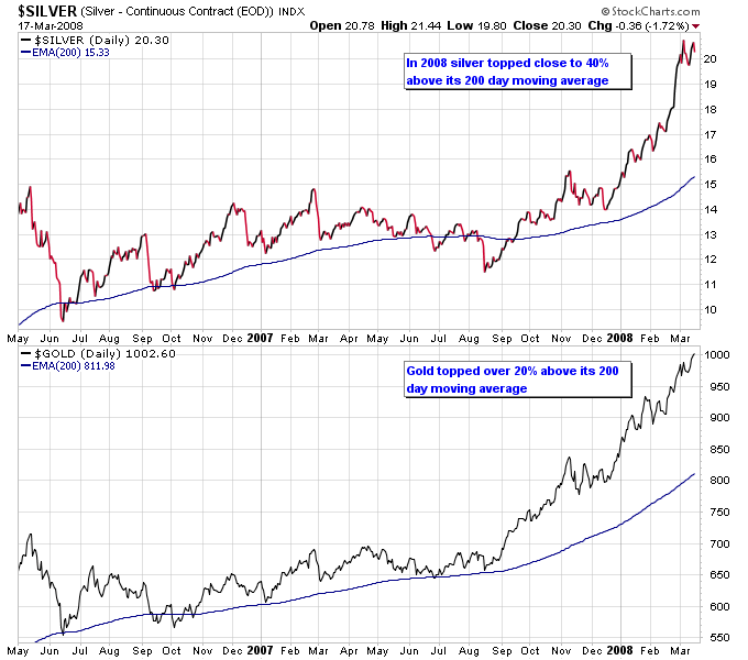
So given that there are two good reasons to be cautious on the silver market, are there any good reasons that caution should be discounted at the current time? Let’s look at the state of the gold market at previous major tops in silver. The next two charts show silver and gold’s relationship to their 200 day moving averages during two previous major tops in silver and gold. Notice how silver and gold made major tops when they both became stretched above their 200 day moving averages.
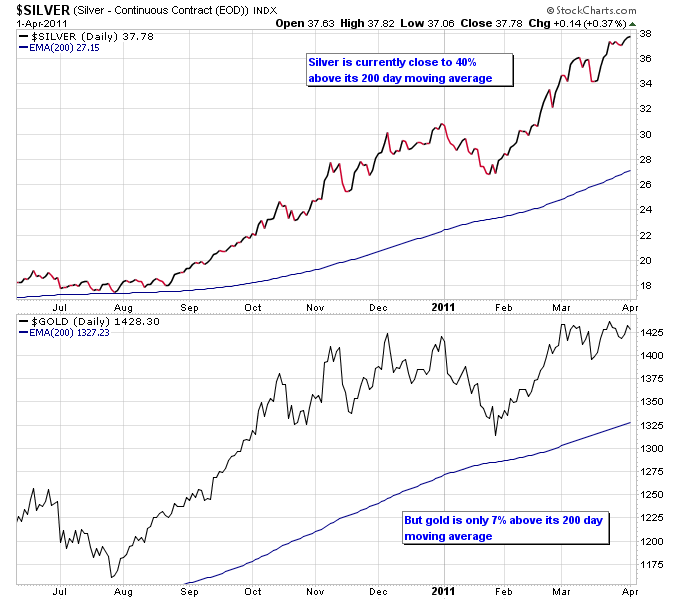
The current state of the silver and gold markets paint a different picture than those two previous tops. Notice how silver is roughly at the same stretched level as it was during previous major tops, hence the caution from the silver gurus. However gold is not even half as stretched as it was during previous major tops in silver and gold.
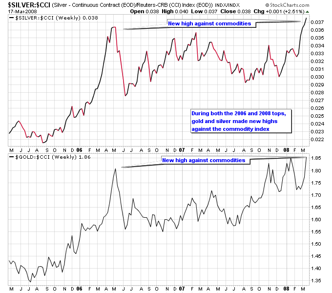
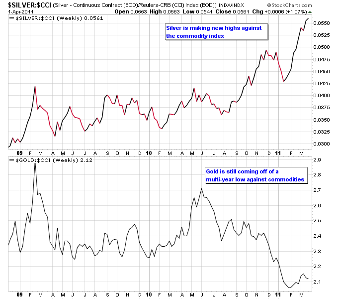
Next let’s look at silver and gold’s relationship to other commodities at previous major tops. Silver and gold have shown a tendency to outperform other commodities as they make long term tops, as evidenced by the next chart.
Looking at the current relationship of silver and gold to commodities, silver is indeed making a new high against other commodities but gold is not only not making a new high, but is still coming off of a multi-year low against other commodities. So not only is gold not stretched against its own long term moving averages, but it is also not overbought against other commodities.
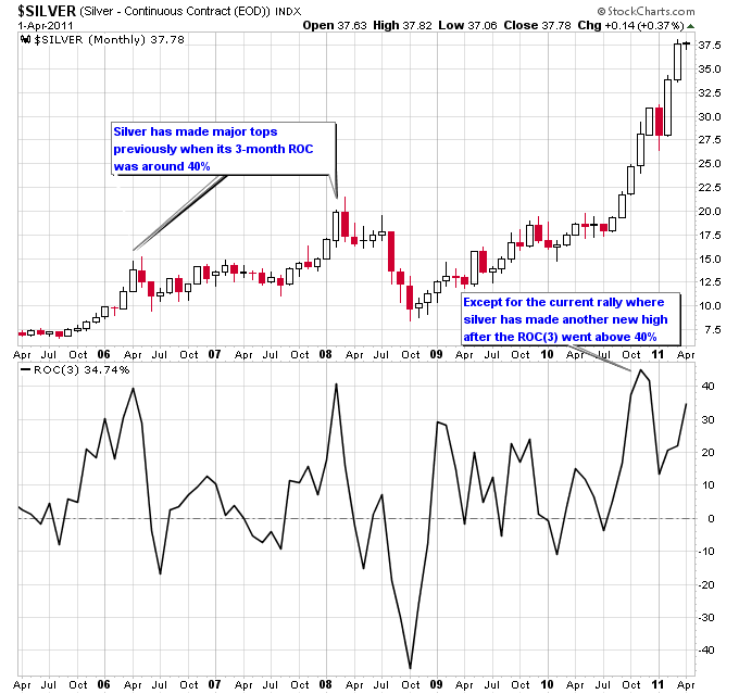
Finally lets look at the nature of silver’s recent spike on the chart. The Rate-Of-Change (ROC) indicator measures the percent change in a market over a specific time period. The current value of the ROC indicator shows the percent change over the latest period defined in parenthesis, so the value of ROC(3) on a monthly chart is the percent change over the last 3 months. The ROC will be extremely high during a spike high in a market. On the two previous major tops in silver the 3-month ROC hit a level of 40%, and then declined for multiple months indicating the end of the rally. During this rally though silver has made another new high after the ROC(3) went over 40% late in 2010, and the ROC(3) is still on the rise.
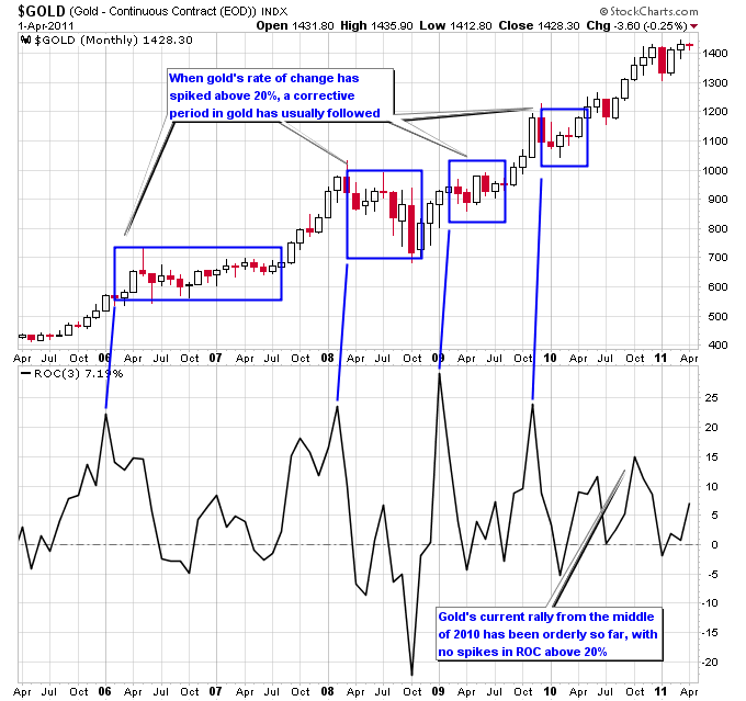
Gold’s ROC(3) has only recently turned higher and is not anywhere near the 20% level that has marked significant tops in gold. Notice on the chart below that each time gold has moved above 20% on the ROC(3) a corrective phase in gold has followed.
Anything is possible in the markets, but if gold follows along with its past history then it isn’t anywhere near the overbought extremes that caused it to make significant tops. And so far during this precious metals bull market, silver has not made a major top independent of gold. So the state of the gold market and how it is not showing signs of a major top could be a flaw in the theory that silver is about to make a major top.
